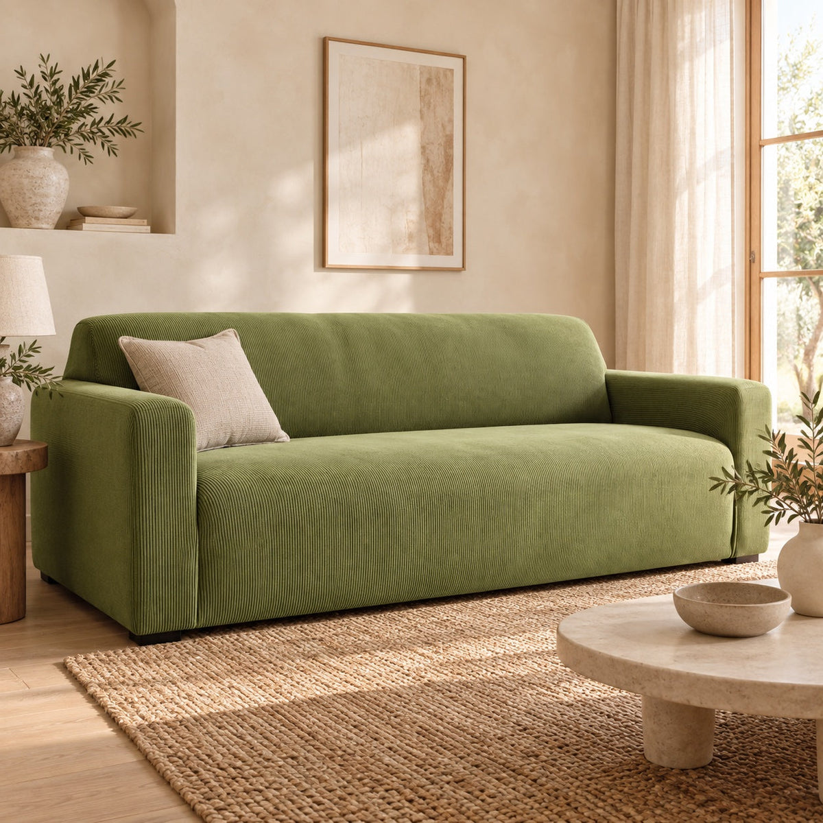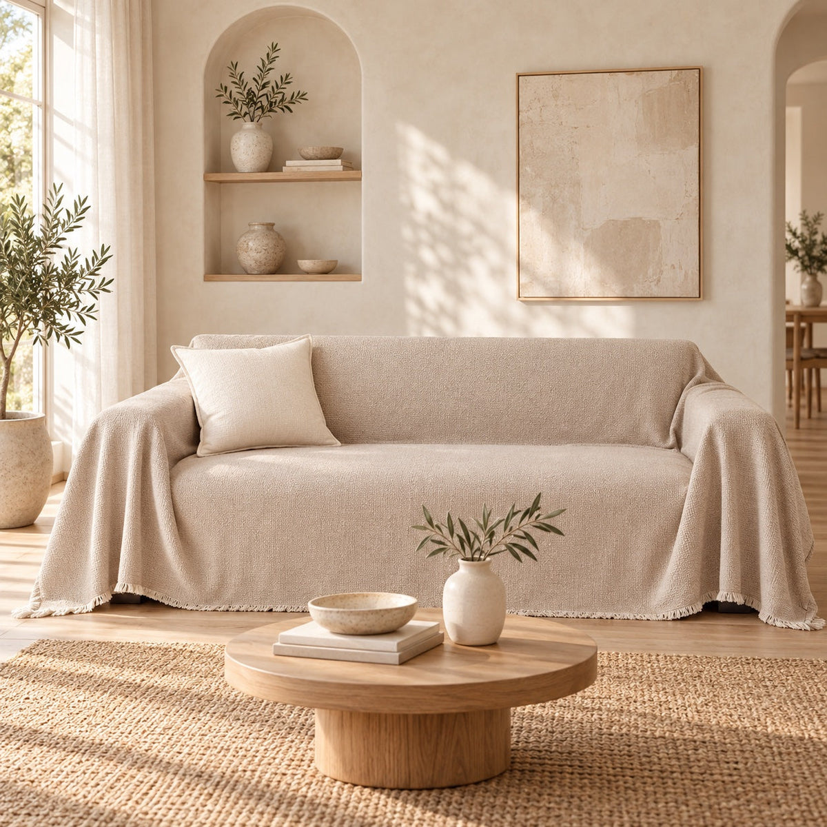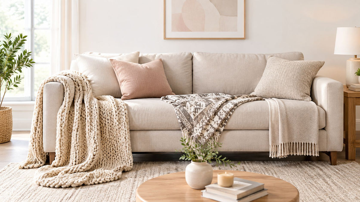
You can make a sofa look finished with one well-chosen decorative throw blanket, and you don't need to chase fibre jargon to do it. The key decision is colour, texture and scale, because a throw is the room's third colour, not just another soft layer.
Table of Contents
- What a Decorative Throw Blanket Is Doing in Your House
- How Do You Choose a Decorative Throw by Colour
- Which Throw Size Suits Which Placement
- How Does Texture Change the Look of a Lounge
- Three Placement Patterns That Always Work
- How to Pick a Decorative Throw for Pets and Rentals
- The Selection Rule That Stops the Overthinking
What a Decorative Throw Blanket Is Doing in Your House
A couple is on the sofa, the cushions have drifted, and a folded throw is sitting on the arm looking half-used and half-forgotten. That throw is still doing work, though, because decorative throw blankets change the room faster than almost any other textile you can move around.
The throw covers a bigger visual field than a cushion, so its colour lands harder and its drape changes the mood of the whole lounge. A cushion gives you a note, a throw gives you a sentence. That's why a throw that reads right can rescue a tired sofa, while a throw that nearly matches the upholstery often disappears into the background and does nothing for the room.
Practical rule: if the throw doesn't read from the doorway, it's probably too close to the sofa colour or too timid in scale.
For Australian homes, that matters because decorative throws sit inside a substantial, stable throw blanket market, with imported supply doing most of the heavy lifting and brand premiums adding much of the value, as outlined in market analysis from IndexBox. The point isn't to buy a “blanket” in the bedding sense. The point is to choose a room-making layer that helps a lounge feel considered without making the furniture feel covered up.
If you want to see the full range before you decide on colour or scale, browse Casamé Home throw blankets. The rest of the choice comes down to where the eye should land first, and that starts with colour.
How Do You Choose a Decorative Throw by Colour
Choose a decorative throw by deciding whether it should act as the room's 10 percent accent or, less often, as a softer 30 percent support colour. The best throws usually borrow from colours already in the room, then shift them into a cleaner, bolder or quieter register.
Designers use the 60-30-10 rule: 60% of the room in the main colour, 30% in a second and 10% in an accent. A throw is the perfect 10%.
Neutral throws work when the room needs calm, not sameness
Neutral throws earn their place when the sofa, rug or wall already carries the visual weight. Cream White, Milk Tea, Beige, Cloud Grey, Silver Grey and Jet Black work because they hold the room together without shouting over it. That's the right move in rooms that already have patterned cushions, strong artwork or a loud rug.
A patterned neutral can still be your accent. Xavier W., a verified buyer of the Atlas Geo Throw Blanket in Cloud Grey, said, "The cloud grey colour goes perfectly with everything, making it heaps easy to style." That's exactly the point, the pattern stays useful because the colour stays easy.
Earthy and accent colours need a clear job
Earthy tones like Cocoa Brown, Espresso Brown, Terracotta, Khaki and Caramel work when the room already leans warm, natural or grounded. They make timber, tan leather and stone-toned upholstery feel more intentional. Accent colours, such as Sage Green, Forest Green, Vintage Pink, Bondi-style blues and Orange, are for rooms that need energy, not another safe layer.
Here's the rule I use on actual sofas. If the room already feels complete, choose a throw that sharpens the palette. If the room feels flat, choose a throw that repeats one existing colour in a fresher shade and makes the eye move.
| Throw Colour Palettes and Where They Sit in the Room | ||
|---|---|---|
| Palette | Example Colours | Best Slot in 60-30-10 |
| Neutral | Cream White, Cloud Grey, Silver Grey, Jet Black | 10 percent accent or 30 percent support |
| Earthy | Terracotta, Cocoa Brown, Khaki, Caramel | 30 percent support, sometimes 10 percent accent |
| Accent | Sage Green, Forest Green, Vintage Pink, Bondi-style blues, Orange | 10 percent accent |
A throw that fights the wall colour usually looks accidental. A throw that lifts one of the room's own colours into a different shade looks deliberate. That's the one to buy.
Which Throw Size Suits Which Placement
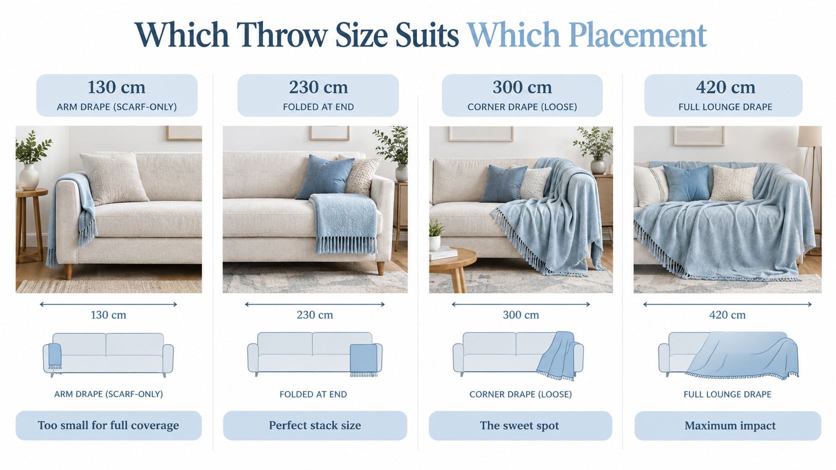
The right size is about scale, not a number on a label. A decorative throw can look polished in one size and sloppy in another, even when the colour is perfect.
Read the four sizes as four visual behaviours
A 180 x 130 cm throw behaves like a scarf. It's fine for an arm drape, but it looks too small for anything that needs presence on a lounge. A 180 x 230 cm throw makes a tidy folded stack at the end of a couch, which is why it's the safest choice when you want order.
A 180 x 300 cm throw has enough reach to drape with intent across two seats or one generous corner, and that's where the styling starts to feel relaxed rather than forced. A 180 x 420 cm throw is the full-lounge statement, the one that can spill across most of the sofa and pool more dramatically if that's the look you want.
Scale check: if the throw looks like it's waiting for another fold to become useful, it's too small for the placement you've chosen.
For a broader sizing reference, the sizes for sofas and beds guide is worth keeping in mind, but the core decision is simple. Use the smallest size only for an arm drape, use the mid-size for a folded end-of-couch stack, and use the larger sizes when you want the throw to act like a visible layer instead of a token accessory.
How Does Texture Change the Look of a Lounge
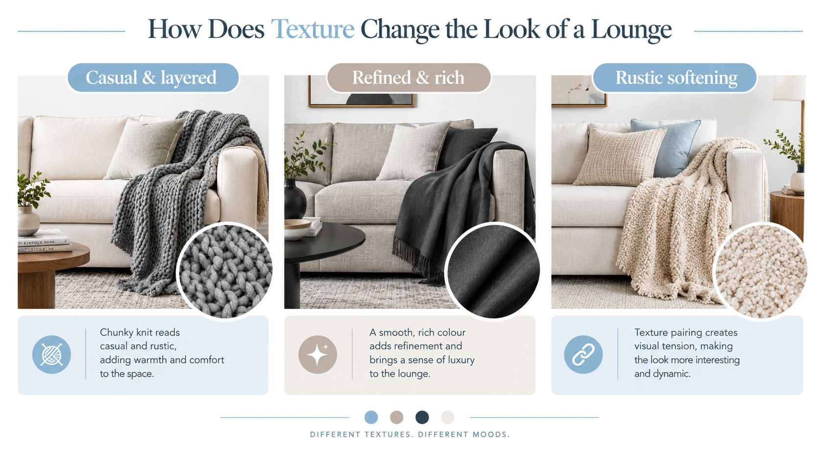
Texture is the second decision after colour, and it can save a sofa that feels too flat. A decorative throw blanket changes the room most when its surface either contrasts with the sofa or settles gently against it.
Chunky on smooth, smooth on textured
A chunky or tactile throw belongs on a smooth sofa because it adds visual weight and stops a plain lounge from looking under-dressed. It makes a soft sofa feel layered and lived in without needing another busy pattern.
A smooth throw belongs on a textured sofa because it keeps the eye calm, which is exactly what you want when the upholstery already has a lot going on. On a deep-pile or heavily textured sofa, a busy throw just competes with the furniture and muddies the silhouette.
The smartest room is not the one where everything matches. It's the one where one surface gives the eye a rest and the other gives it something to notice, so the better question is which side your sofa is already doing for you. For the full texture picture, see the textured throw blanket guide.
Three Placement Patterns That Always Work
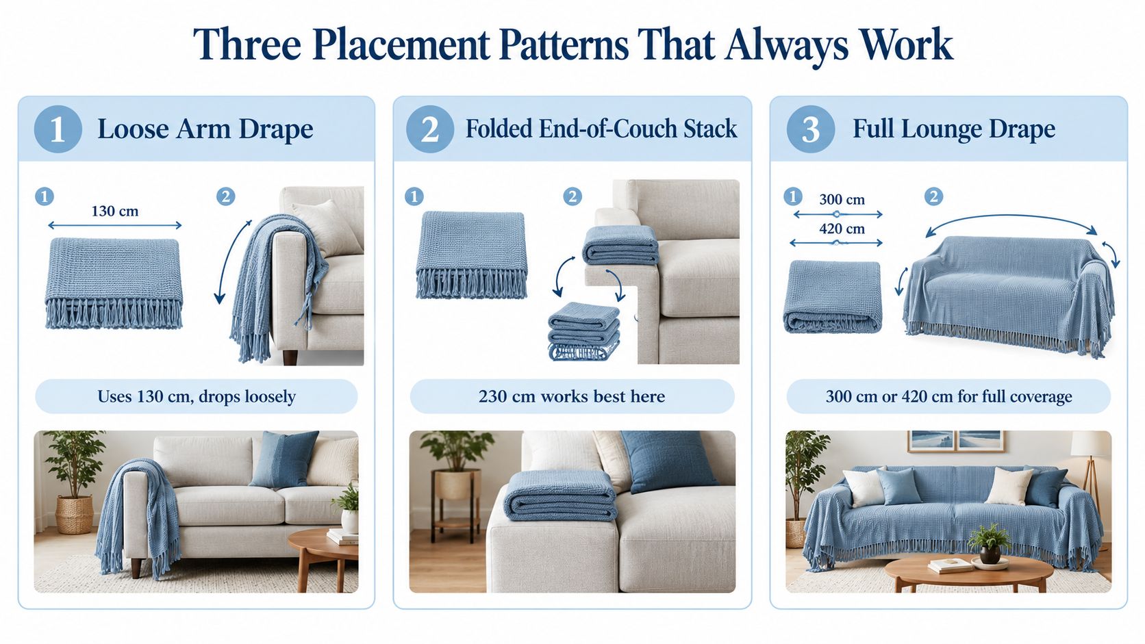
The throw looks most intentional when it has a job, and three placements cover nearly every lounge that needs styling. Loose arm drape, folded end-of-couch stack, and full lounge drape are the patterns that read as design, not leftovers.
Loose arm drape
A 180 x 130 cm throw suits the loose arm drape when you want a casual corner of softness and nothing more. Dropped over one arm, it should fall with intent and not look like it lost its place. This is the pattern for relaxed rooms, but it only works if the throw has enough structure to hold a shape instead of collapsing into a lump.
Folded end-of-couch stack
A 180 x 230 cm throw is the cleanest answer for a folded end-of-couch stack. Fold it once or twice, lay it across the arm or back edge, and let it act like a visual anchor at one end of the sofa. This is the most versatile placement because it looks polished in both plain and patterned rooms.
Full lounge drape
A 180 x 300 cm or 180 x 420 cm throw suits a full lounge drape, where the throw becomes a layer over the sofa rather than a small accent. Use the 180 x 300 cm size when you want looseness with control, and reach for the 180 x 420 cm size when you want the throw to dominate the visual field. A chunky knit can fight this look, while a smoother finish keeps the lines cleaner.
For a visual method on the sofa itself, how to style a throw blanket is the right companion piece. The key is simple, place the throw where the room needs weight, not just where your hand lands first.
How to Pick a Decorative Throw for Pets and Rentals
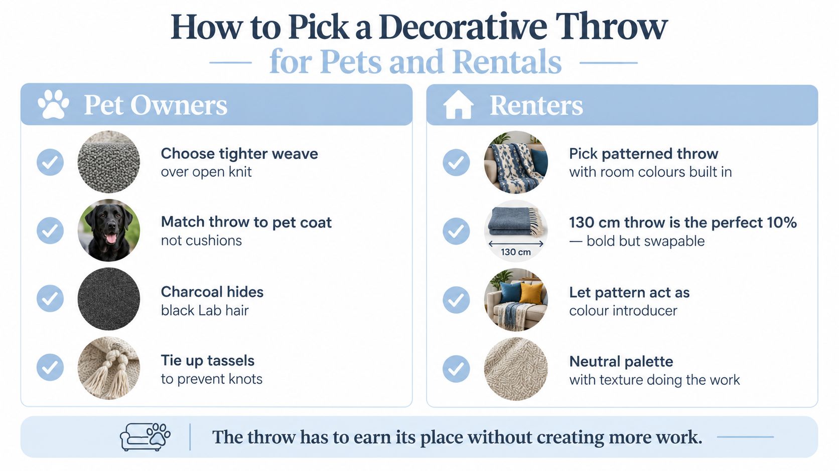
Pick a decorative throw for pets and rentals by choosing a surface that works harder than it looks. In both cases, the throw has to reduce work, not add to it.
Pet owners need a throw that forgives contact
A tighter weave is the safer move for homes with pets because loose loops snag more easily. If the throw sits on a sofa that a dog or cat uses daily, match the throw to your pet's coat, not your cushions. A cream throw under a black Labrador is a losing battle, and a charcoal one hides almost everything.
For washing, check the throw fits your machine drum with room to move, and tie up or bag any tassels so they don't knot.
Renters need a non-permanent colour tool
A throw is one of the easiest ways to change a rental lounge without touching the walls or furniture. A single accent throw can shift a beige sofa into a room with more personality, then leave with you when the lease ends. That's why pattern matters so much in rentals, because a patterned throw can introduce the room's secondary colours without making a permanent commitment.
Rental rule: if the sofa is plain, let the throw do the talking. If the sofa is already busy, keep the throw quieter and use colour restraint instead.
The honest choice for both pet owners and renters is the same. Pick the throw that can absorb daily use, still look deliberate, and stop the room from feeling unfinished.
The Selection Rule That Stops the Overthinking
Stop trying to make the throw disappear into the sofa. A decorative throw bought to match perfectly usually looks timid, and when the tone is too close, the whole lounge reads like one flat block.
Choose the throw that pulls a colour from the room instead. That can come from artwork, a cushion, a rug or a smaller accent already doing work elsewhere. When the throw repeats a room colour in a fresh shade, it looks intentional, and it gives you more flexibility if the rest of the room changes later.
The opposite is also true. A throw that blends too closely into upholstery can make stains and wear feel more visible, because the eye loses a clean edge to read. A little contrast is what makes the throw look chosen instead of forgotten.
A quick checklist keeps you honest when you're holding two throws in front of a cart:
- Third-colour test: does the throw add a colour the room already wants, rather than inventing a new one?
- Contrast test: does the throw stand apart from the sofa enough to read as styling?
- Scale test: does the size suit the placement pattern you use?
- Hand test: if you reach for one first, trust that reaction more than the safer option.
Casamé Home carries decorative throws that let you choose by colour, size and finish without turning the decision into a fabric lecture. If you want to compare the ranges against your sofa, your cushions and your room colours, visit Casamé Home and pick the throw that earns its place on the couch.