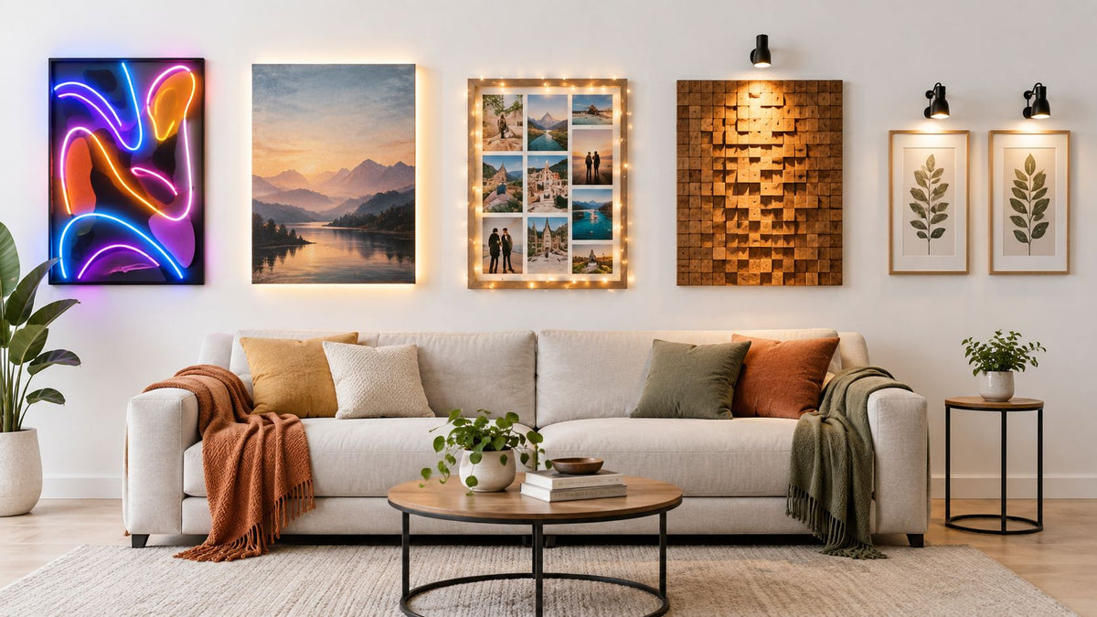
Lighting already matters in Australian homes. Wall art with lights can make a lounge feel more intentional, but the light direction matters. Raking light emphasises surface texture and small creases, while diffuse backlighting makes the sofa look flatter.
Key Takeaways Wall Art With Lights
Light Changes the Sofa: Lit wall art changes how the sofa below looks.
Choose Forgiving Tones: Beige and textured fabrics sit well under wall lighting.
Judge From the Lounge: Plan the lit art from where you sit.
That's the part most wall-art advice skips. The usual focus is the artwork itself, but what you live with every day is the effect that lit piece has on the lounge sitting directly beneath it. A downward-throwing frame can sharpen every little fold in a smooth couch cover by evening. An evenly backlit panel can do the opposite and soften the look of weekly settling.
The wall art and lighting are your choices, not ours. What's worth judging carefully is what those choices reveal about lounge textiles, especially if your sofa has a smoother face, a textured jacquard, or a pile fabric such as velvet. The five ideas below stay on that practical line: light behaviour, placement height, visible texture, colour response, and low-risk planning for real lounges without drifting into fixing or wiring advice.
Table of Contents
- 1. Veloura Cushion Cover · Beige
- 2. Rivelle Cushion Cover · Cream White
- 3. Crossmere Cushion Cover · Beige
- 4. Crossmere Cushion Cover · Space Grey
- 5. Avelia Couch Cover · Blue · Stretch Fit
- Lounge Textiles Under Lit Wall Art, 5-Item Comparison
- Let the Sofa Decide the Light
1. Veloura Cushion Cover · Beige
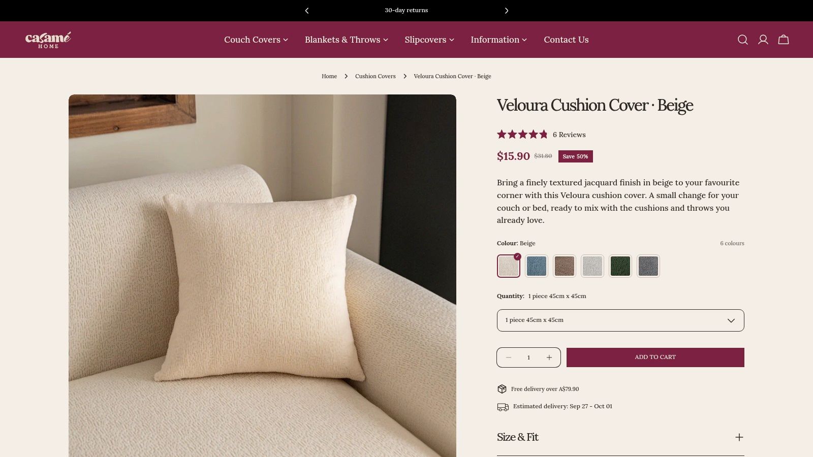
A lit wall piece does not just change the wall. It changes how the sofa reads from seat height upward. With a beige cushion like Veloura, the main question is simple: does the light skim across the lounge and pick out every crease, or does it spread broadly enough to keep the sitting area settled?
Veloura is useful because it sits between a flat woven cover and a more pronounced fabric such as velvet. The surface has enough grain to catch light in small breaks instead of one hard strip, which helps when illuminated art throws light downward onto the top of the back cushions. In a real lounge, that usually means the cushion looks intentionally textured while the sofa beneath looks less sharply creased.
Does a textured cushion help under raking light?
Usually, yes.
A grainy face gives the light somewhere to disperse before your eye drops to the seat and back below. On a smoother cushion, the same beam can read as a clean highlight at the top and a set of stronger shadow lines lower down, which often makes normal settling look messier than it is. Beige helps moderate that effect because it tends to show contrast more softly than darker neutrals under warm evening lighting.
There is a trade-off. Texture softens minor wrinkles, but it also becomes more active when the light is narrow and directional. If the wall art already has a strong edge glow or a picture-light effect, restraint usually looks better than quantity. A couple of textured accents often do more for balance than covering the whole sofa in visibly tactile fabrics.
Practical rule: If the lit art throws a bright vertical wash onto the wall behind the sofa, start with cushion covers you can swap out rather than a full texture change across the entire seating area.
Mounting height still affects what you notice first. In lounge terms, lower placement or a stronger downward throw brings more attention to the sofa's top edge, cushion corners, and the small pulls that appear after regular use.
What works in a beige lounge and what doesn't?
Veloura tends to work best under soft-edged light, edge-lit art that glows outward rather than down, or diffuse illumination that leaves the sofa with fewer hard shadow bands. Those setups let the cushion texture read as depth rather than visual noise.
It is less forgiving under a tight, cool beam aimed straight toward the seating zone. That kind of light can make the grain look dry and can sharpen the transition from cushion front to sofa seam underneath.
A few pairings are usually easier to live with:
- Diffuse or edge-lit wall art with beige texture: Keeps the sofa looking calm while still giving the upper half of the lounge some tactile detail.
- Downward-throwing light with limited textured cushions: Helps break up the beam without making the whole arrangement look busy.
- Smooth sofa covers with textured beige cushions: Adds a controlled point of texture, so the eye lands on the cushion first instead of every crease along the seat.
The useful distinction is not “texture or no texture”. It is where texture sits in the room and how the light reaches it. Veloura works best when you want the eye to pause on the cushions, then move outward to the lit wall, without overreading the normal folds and settling in the sofa beneath.
2. Rivelle Cushion Cover · Cream White
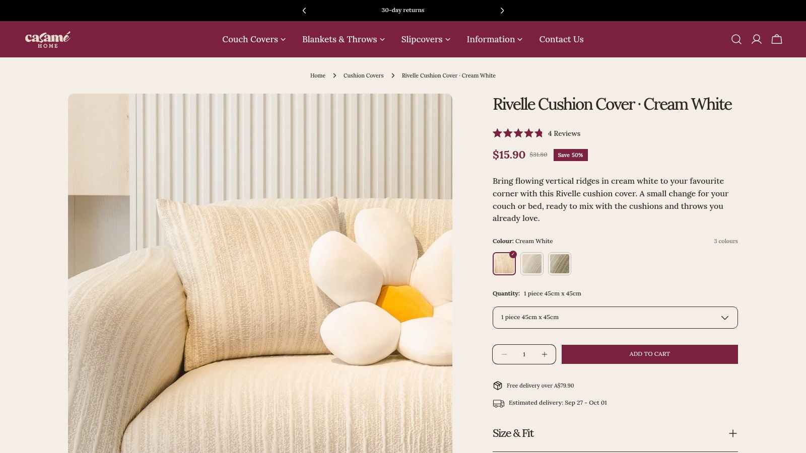
A pale ribbed cushion is not automatically the safe choice under lit wall art. In many lounges, it is the surface that shows the light pattern first.
Rivelle-style vertical ribbing in cream white reacts strongly to beam direction. A downward-throwing picture light can catch the rib tops and leave the grooves slightly grey, which makes the cushion look more striped and also throws more attention onto the sofa seat beneath it. On a sofa with light creasing or a relaxed fill, that usually means the whole seating line looks more settled by evening. Edge-lit or halo-style wall art does the opposite. It keeps the cushion face more even, so the ribs read as texture instead of contrast.
That trade-off matters more on cream white than on beige. Cream reflects more of the room back at the eye, so it picks up mixed LEDs, lamp warmth and any cooler spill from the artwork.
How does ribbing affect the sofa underneath?
It changes where the eye stops.
With a smooth cushion, the eye often drops to the seat and notices the top seam, the front crown of the back cushions, or the slight dip where people usually sit. With a ribbed cream cushion, the eye can hold higher if the light is soft enough. If the beam is narrow, the ribs become a set of bright and dull stripes, and that visual rhythm can make the sofa beneath look more uneven by comparison.
This shows up most in darker lounges. Put cream white ribs on a charcoal or deep taupe sofa under a concentrated wall light, and the cushion can look crisp while the sofa body looks tired. Switch to a broader wash or a diffuse backlit piece, and the same sofa usually looks fuller and calmer.
A useful rule is to match the wall light to the scale of the texture. Ribbing wants spread, not glare.
For practical coordination:
- Use cream ribbing where the wall art glows outward: That keeps the cushion bright without carving hard channels into the fabric face.
- Be cautious with tight top-down lighting over relaxed seating: It can sharpen both the ribs and the sofa's natural settling.
- Pair visible rib texture with smoother surrounding fabrics: Velvet, plain weaves, or cleaner seat surfaces stop the whole arrangement from looking restless.
This also helps explain why textured jacquard, velvet and smooth cloth behave so differently under lit art. Jacquard tends to break light into pattern, velvet darkens or brightens with pile direction, and a ribbed surface sets up repeated lines. If you are comparing options by surface rather than colour alone, the cushion covers collection is a better reference point than treating all cream cushions as interchangeable.
3. Crossmere Cushion Cover · Beige
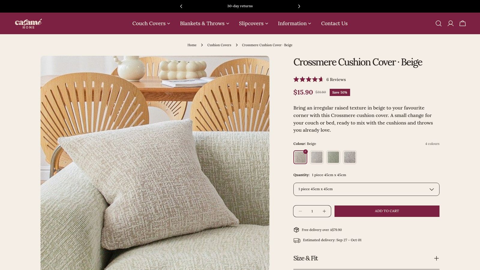
Beige Crossmere earns its place under lit wall art for a simple reason. It changes how the sofa reads before it changes how the wall looks.
From the seat, a marled, nubby surface breaks up the small signs that evening light tends to expose on a sofa: light creases near the front edge, slight compression in the back cushions, and the uneven settling that shows up after real use. A smoother cushion cover can make those changes around it look sharper. Crossmere usually does the opposite. It gives the eye more texture to read, so the sofa body beneath feels less picked apart by the light above.
The type of wall light matters here. Edge-lit art tends to spread a softer halo across the upper part of the lounge, and beige marl handles that well because its colour variation stays gentle. A downward-throwing picture light is less forgiving. If the beam drops far enough to catch the top of the back cushions, the raised flecks in the weave can look pleasantly dry and tactile, but the seat below may still show dips and drag lines. Diffuse illuminated art sits in the middle. It usually makes this kind of cushion feel calm rather than fussy.
What does marled texture actually improve?
Mostly, it improves transitions.
That is the useful part in a lived-in lounge. You are not asking a cushion to hide wear completely. You are asking it to soften the jump between a lit wall, a sofa back, and a seat that has a few natural folds. Beige Crossmere does that better than a plain smooth cloth because the weave already contains minor tonal shifts. Under evening lighting, those shifts stop every crease from reading as a separate event.
It also behaves differently from velvet and jacquard. Velvet reacts to pile direction, so one sweep of light can make one side look richer and the other flatter. Jacquard carries a woven pattern, which can hold up well under light but can also introduce more visual activity across the sofa. Crossmere is quieter than both. That makes it useful when the art itself is already doing enough.
One caution. If the sofa fabric is very smooth and tightly upholstered, adding a heavily nubby beige cushion can make the cushion look intentionally rustic while the sofa looks formal. That contrast can work, but only when the wall light is soft enough to join the two surfaces rather than separating them.
Beige Crossmere suits lounges where the artwork is lit at night but the seating area should not look overly styled. It works on a sofa that gets used, settles a bit, and benefits from a surface that reads relaxed under light. The result is less about decorating the wall and more about keeping the couch beneath it looking settled, warm, and believable.
4. Crossmere Cushion Cover · Space Grey
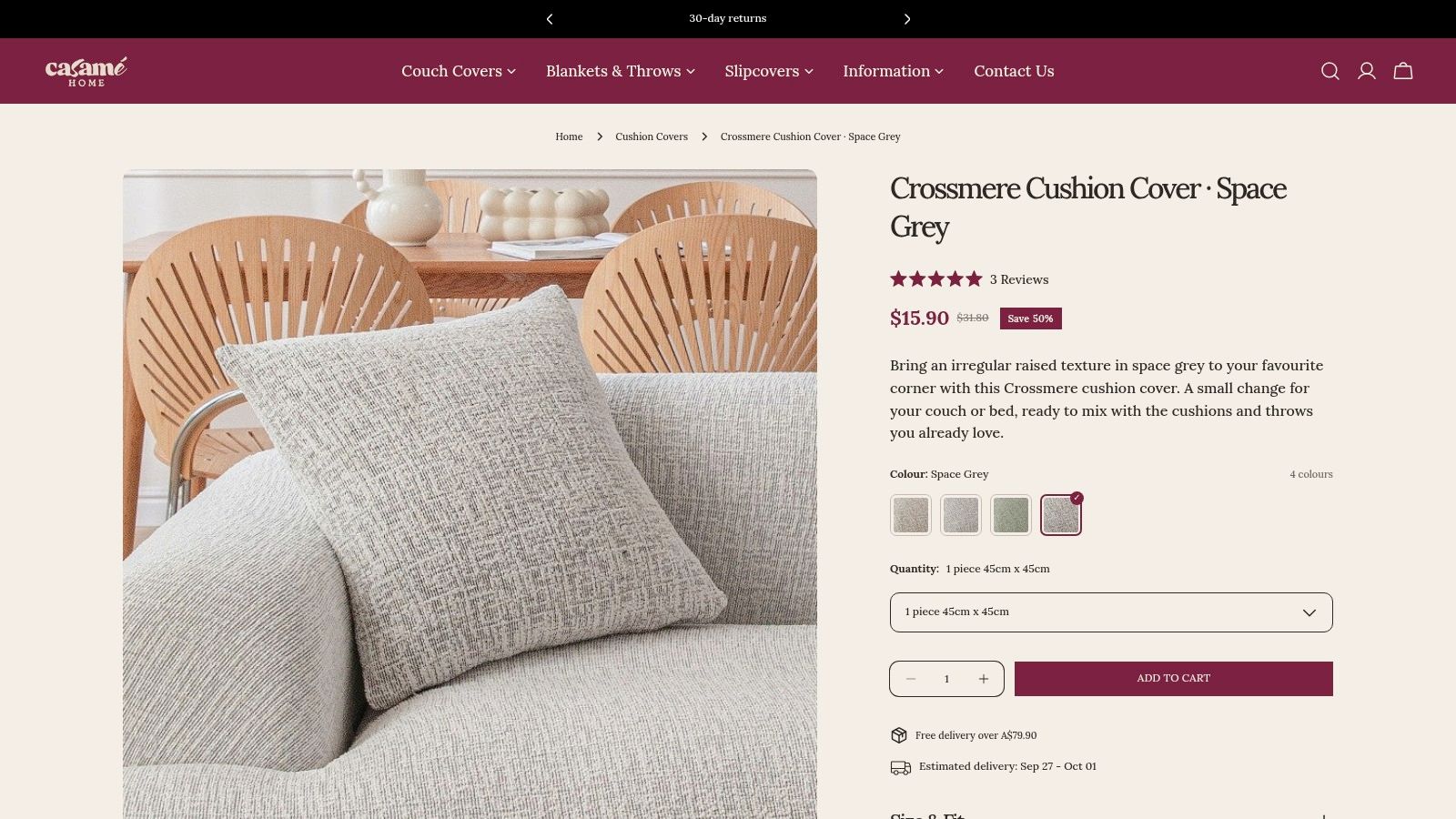
Space grey is less forgiving than beige. It makes the sofa beneath the lit artwork look more deliberate, but it also makes small lighting inconsistencies easier to see from the seat.
That matters with wall art lighting because the beam type changes what the cushion reports back. A narrow downward throw picks up the high points in Crossmere's texture and can make the front edge of a cushion read cooler than the centre. Edge-lit art is usually calmer. It tends to spread light across the sofa back without carving every crease into view. Diffuse light is the easiest pairing of the three because it keeps the grey looking even and stops the cushion from turning flat or metallic.
Grey also reacts differently from velvet and jacquard. Velvet can shift shade with pile direction, so one hand mark or seating impression becomes part of the look once light hits it. Jacquard has its own raised pattern, which can hold interest under a stronger beam. Crossmere sits between them. It has enough surface to soften minor settling, but not enough pattern to disguise a mismatched warm bulb on one side of the room and a cool art light above.
A simple lounge test helps here. Sit where you normally watch TV at night and switch on only the art light and the lamp you use. If the grey cushion suddenly looks bluer, flatter, or sharper than the sofa fabric around it, the issue is usually the light mix rather than the cushion itself.
Space grey needs the most care in lounges with smoother upholstery. On a smooth synthetic or tightly woven sofa, grey Crossmere can create a crisp contrast that looks clean under controlled lighting and slightly stern under cooler LEDs. On a brushed fabric or a sofa with a bit of visual grain, it settles in more naturally.
The appeal is clarity. The trade-off is that clarity cuts both ways. If the wall lighting is already consistent, space grey gives the seating area a cleaner outline under the artwork. If the room relies on mixed lamps and one feature light above the wall piece, beige is usually easier to live with night after night.
5. Avelia Couch Cover · Blue · Stretch Fit
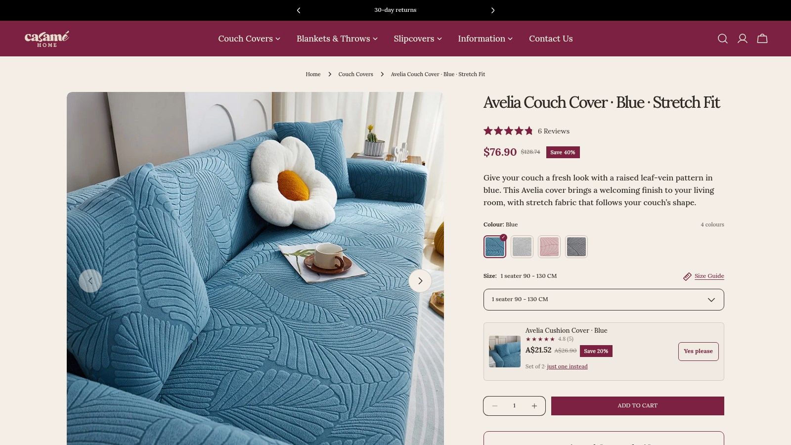
A jacquard couch cover is usually the best match for wall art with lights if you know the beam will rake across the sofa. The reason is simple. A woven raised pattern already holds shadow and relief, so small weekly shifts in the fabric don't stand out as abruptly as they do on a smooth surface.
That's the strength of a product like Avelia. The raised botanical leaf jacquard in blue gives the lounge its own visual structure before the wall light even switches on. When the art above throws light downward, the sofa doesn't suddenly become a plain stage for every tug, crease, or slight settling mark.
Does jacquard cope better than smooth fabric under a picture light?
Yes, jacquard usually copes better than smooth fabric under a picture light because woven relief disguises minor movement and breaks up glare across the couch face. Blue also tends to read with more depth than pale neutrals when evening lighting hits at an angle.
Worth keeping in mind when you plan the room: you're not only choosing a decorative object. You're choosing an accent-lighting effect that will change how the full lounge surface reads.
Buyer lens: Treat illuminated wall art as part of your lounge lighting plan, not as a separate styling accessory.
What does blue jacquard do under warm light?
Blue jacquard under warm light tends to gain depth without turning glossy, provided the fabric texture is doing most of the visual work. That's where a raised woven motif earns its keep. The light finds the relief, not just the wrinkles.
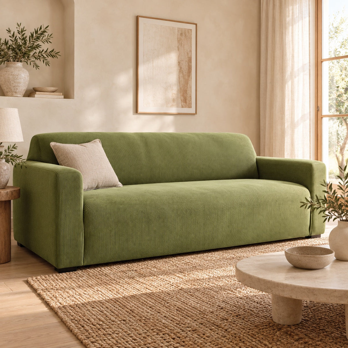
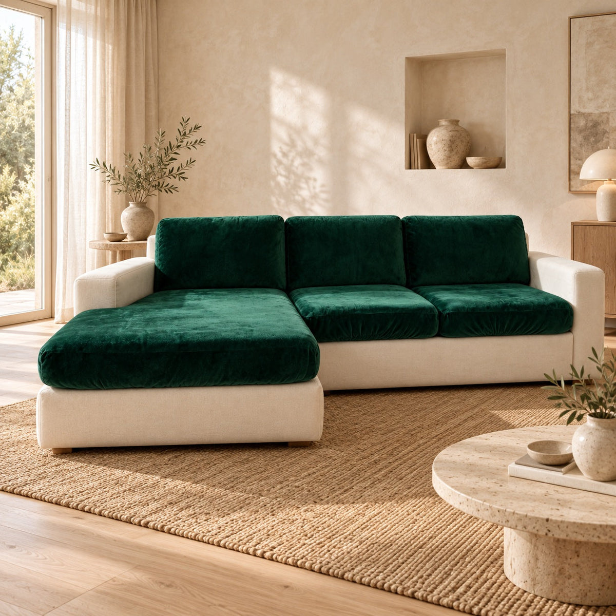
The couch cover range is relevant here because a textured stretch cover gives you more room to work with dramatic lighting than a flatter lounge surface does. The art on the wall is the customer’s own choice; they can match it against the cover palette, including sage green, sky blue, chestnut brown, garnet red, cream, black, dark grey, off-white, chocolate, navy blue, light grey and Bondi blue. The velvet couch cover palette includes Grey, Beige, Dark Green, Lake Blue, Orange, Navy Blue, Light Grey, Pink and Brown. The useful distinction isn't only colour. It's that jacquard tends to disguise small rucks through woven texture, while velvet changes tone as the nap reflects warm light differently along the pile and against it.
Lounge Textiles Under Lit Wall Art, 5-Item Comparison
| Product | Texture & Fit ⚡ | Care & Complexity 🔄 | Expected Outcome ⭐📊 | Ideal Use Cases 💡 | Key Advantages 💡 |
|---|---|---|---|---|---|
| Veloura Cushion Cover · Beige | Soft bouclé-style textured knit; fits 45×45 cm; sold individually or as set | Machine washable (gentle); very low effort | Enhances tactile warmth and visual depth; light surface protection. ⭐⭐ | Accent cushions; layered sofa styling; cosy interiors | Soft bouclé hand; quiet refinement; easy coordination |
| Rivelle Cushion Cover · Cream White | Flowing vertical rib texture with soft crinkle; fits 45×45 cm | Machine washable (gentle); very low effort | Adds vertical texture and subtle movement; light surface protection. ⭐⭐ | Minimalist or textured schemes; neutral accents | Distinct ribbed texture; gentle drape; easy care |
| Crossmere Cushion Cover · Beige | Marled cross-weave with nubby hand; fits 45×45 cm | Machine washable (gentle); very low effort | Delivers cosy, tactile interest and muted depth; light surface protection. ⭐⭐ | Rustic, layered or neutral palettes; casual living spaces | Nubby marled look; tactile warmth; versatile neutral |
| Crossmere Cushion Cover · Space Grey | Marled cross-weave with nubby hand; fits 45×45 cm; darker tone | Machine washable (gentle); very low effort | Same tactile interest as beige with stronger contrast; light surface protection. ⭐⭐ | Modern neutrals; high-contrast accents; living rooms | Deep tone option; same nubby texture; durable appearance |
| Avelia Couch Cover · Blue · Stretch Fit | Raised botanical leaf jacquard in relief; flexible fit for 90–300 cm (1–4 seater) | Machine washable (gentle); moderate effort to stretch and tuck for tailored fit | Transforms sofa appearance and helps protect against stains, pet hair and everyday wear. ⭐⭐⭐ | Protecting worn sofas; pet households; seasonal style refresh | Tailored, sculpted look; broad size compatibility; protective and decorative |
Let the Sofa Decide the Light
Wall art with lights works best when you judge it from the lounge upward, not from the wall downward. Start by looking at the beam itself. If the light rakes across the sofa face, it will emphasise texture, settling, and any small creases that build up through the week. If the light diffuses over the wall and spills gently onto the couch, the seating area will usually look calmer and flatter.
Then assess the sofa. A smooth surface asks for more caution because directional light exposes more. A textured woven face has more forgiveness. Jacquard is especially useful here because its figure is woven into the cloth, so the fabric already carries pattern and shadow that can disguise small rucks. Velvet behaves differently. Velvet can look rich under warm light, but the pile shifts tone as the nap reflects one way and then the other.
Placement still matters. Angle and distance shape glare more than people expect, and both change how much of the beam lands on the lounge rather than on the artwork itself.
The simplest decision sequence is usually enough. First, observe whether the wall art light rakes across or diffuses over the sofa. Next, decide how much texture and settling your lounge already shows. Last, choose colour and textile balance that support that effect instead of fighting it. Keep the final check practical. Stand where you usually enter the room, where you sit, and where the lit piece falls in your sight-line. If the art looks beautiful but the sofa underneath suddenly looks restless every evening, the lighting choice still needs work.
Casamé Home doesn't sell wall art or lighting, but it does offer the part of the room that illuminated art changes most visibly: stretch couch covers, cushion covers, and other lounge textiles that affect how texture, colour, and creasing read under light. If you're adjusting the sofa side of the equation, visit Casamé Home to compare textured and smoother cover options for the way your living room is lit.